

Love Hearts. Drumstick. Parma Violets. Refreshers. Fizzers. Consumers knew the products, but the connection between them was much weaker.
Swizzels Matlow wasn't benefiting from the collective recognition, heritage and trust sitting across its portfolio.
With hundreds of products and formats, the opportunity was much bigger than a redesign. It was about creating a clear brand architecture and hierarchy that connected those individual brands back to Swizzels without taking away what made each one distinctive.

The individual brands still needed to lead. The answer wasn't to make Love Hearts, Drumstick or Parma Violets less distinctive. It was to make Swizzels the consistent masterbrand endorsement behind them.
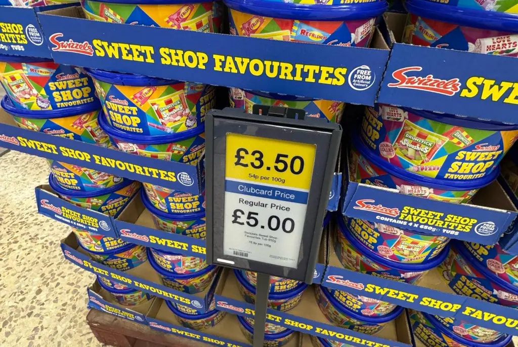
I established a clearer hierarchy across the portfolio, making Swizzels more prominent and applying it consistently across packaging, advertising and communications.
Packaging also became a tool for cross portfolio discovery. Other Swizzels products appeared on the back of packs, helping consumers connect familiar brands and understand they came from the same British confectionery maker.
That quietly transferred the trust, fun, familiarity, quality and heritage of the individual products back into Swizzels itself.
The new architecture gave Swizzels a much stronger and more consistent presence across the portfolio, from individual wrappers and sharing bags to cases, retail displays, advertising and new product launches.
And the transformation didn't stop at how the portfolio looked. It also changed how the packaging worked.
Packaging was reviewed to reduce unnecessary material and move towards more sustainable solutions. Love Hearts is one example: the additional paper layer was removed and replaced with a single recyclable film wrap, using less material, reducing waste and creating a simpler, more efficient format while retaining the distinctive roll.
